

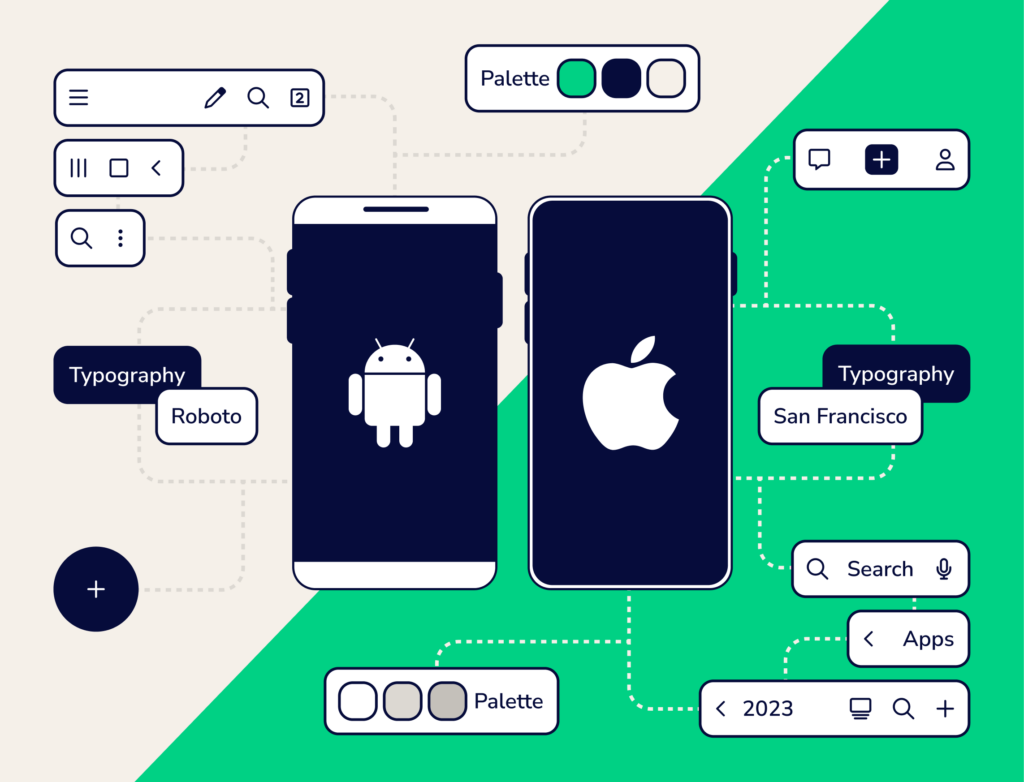
In the ever-evolving world of mobile app development, one of the pivotal challenges developers face is crafting a compelling user interface (UI) that works seamlessly on Android and iOS devices. While both platforms offer immense opportunities to reach a wide audience, they each come with their own set of design principles, guidelines, and behaviors that can make the development process a tad tricky.
In this article, we’ll dive into the essential differences between developing a mobile app’s UI for Android and iOS devices.
Differences in App Development Environment
Android and iOS app development takes place in two different universes.
Android developers primarily use Java or Kotlin programming languages and use XML for designing the UI layout. Developers have the freedom to design their app’s UI layout the way they like.
On the flip side, iOS uses Swift or Objective-C programming languages, and developers can use Apple’s Interface Builder to design the UI layout. Apple’s Auto Layout system can also help manage the responsiveness of an iOS app’s UI.
Backwards Compatibility
Developers will need to consider backward compatibility with older device versions, especially for Android devices. Many Android devices use older versions, so developers will have to consider using different design approaches to ensure their app remains compatible on all Android devices.
IOS devices typically receive updates more consistently, so developers don’t have to spend as much time considering the backward compatibility of their app.
OS-Specific UI Design Guidelines
Developers must adhere to specific UI design guidelines for each platform to ensure a seamless user experience between mobile devices and third-party apps. Ignoring these guidelines can lead to inconsistencies, leaving users perplexed as they navigate different interfaces.
- Android: Android follows Google’s Material Design guidelines. Material Design 3, Google’s latest guidelines version, emphasizes tactile surfaces, vibrant colors, and bold typography, and encourages the use of motion and elevation to create a sense of depth and hierarchy in the UI.
- iOS: iOS adheres to the Apple’s Human Interface Guidelines (HIG), which prioritizes simplicity, clarity, and elegance, and emphasizes minimalistic aesthetics, clean lines, and legible text.
Notable Differences in UI Design for Android and iOS apps
Now let’s discuss some of the major differences in UI design between Android and iOS.
Navigation
Navigation serves as the GPS of any mobile app, guiding users through its structure and facilitating interactions.
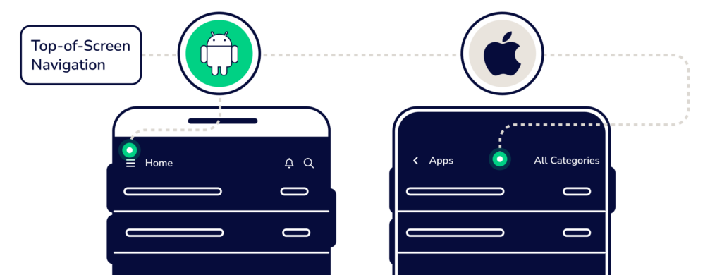
Top-of-Screen Navigation
- Android: Android apps often feature a top-of-screen navigation drawer accessible via a hamburger menu icon. This drawer slides from the left to reveal primary navigation links.
- iOS: iOS relies on a navigation bar located at the top of the app, where users expect to find primary navigation links such as tabs or titles.
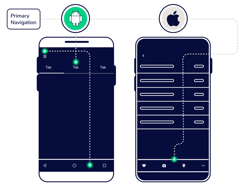
Primary Navigation
- Android: Android apps typically employ a navigation drawer for primary navigation. Users can switch between different sections by tapping items in the drawer.
- iOS: iOS apps frequently use tab bars at the bottom for primary navigation. Each tab represents a distinct section or view within the app.
Secondary Navigation
- Android: Secondary navigation often employs tabs positioned at the top of the screen or below the app bar.
- iOS: iOS apps utilize navigation bars and back buttons for secondary navigation, enabling users to delve deeper into hierarchical content.
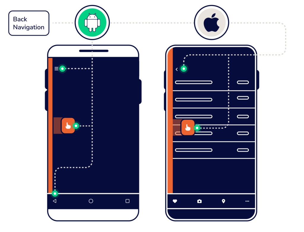
Back Navigation
- Android: Android devices feature a dedicated back button, facilitating navigation backward through the app’s hierarchy. Developers must ensure proper handling of this feature.
- iOS: On iOS, users rely on swipe gestures from the left edge of the screen or the back button in the navigation bar to navigate back through the app’s hierarchy.
Typography and Icons
The typography and icons used in an app play a crucial role in creating a consistent and appealing UI while also maintaining a company’s brand guidelines.
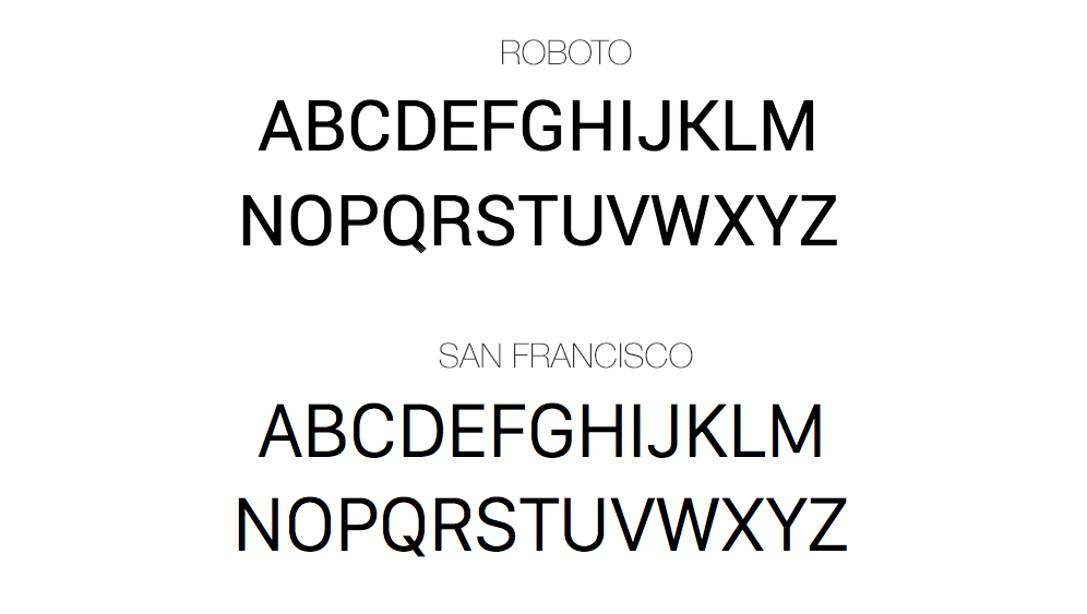
Typography
- Android: Material Design typography guidelines recommend using the Roboto font family for a modern and clean appearance. Custom fonts are encouraged for a unique brand identity.
- iOS: HIG typography guidelines suggest using the San Francisco font family, emphasizing legibility and simplicity.
Icons
- Android: Material Design provides a set of icons aligned with Android’s design language. These icons sport a consistent style and are customizable to suit individual preferences.
- iOS: HIG guidelines offer native iconography, designed to seamlessly match the platform’s aesthetic. Developers can also create custom icons adhering to Apple’s guidelines.
Color Palette
Colors are used to convey brand identity and play an important role in an app’s UI.
- Android: Material Design color guidelines encourage the use of vibrant colors with bold contrasts, with a predefined color palette ensuring a consistent and visually appealing UI.
- iOS: Apple’s HIG color guidelines typically adopt a more subdued and subtle color palette, favoring simplicity and elegance.
Controls
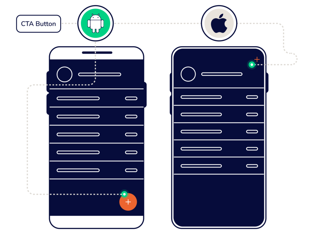
Call-to-Action Buttons
- Android: Material Design emphasizes the use of Floating Action Buttons (FABs) for primary actions, often placed at the bottom right of the screen with a drop shadow for added prominence.
- iOS: iOS apps employ primary action buttons (UIBarButtonItem) located either in a toolbar or navigation bar. These buttons are styled with titles or images to effectively capture the user’s attention.
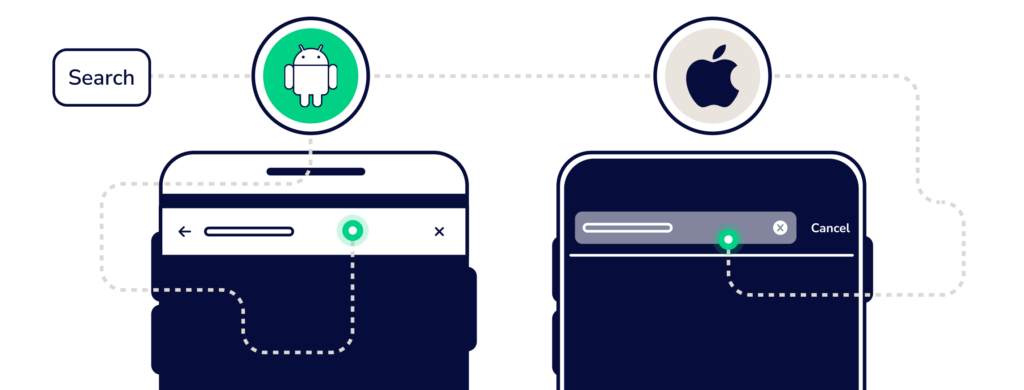
Search
- Android: Android apps commonly feature a search bar at the top of the screen for user queries.
- iOS: iOS apps may utilize a search bar in the navigation bar, offering a similar search experience, but seamlessly integrated into the overall UI.
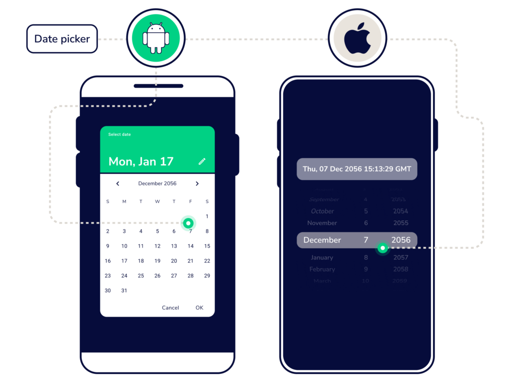
Date Pickers
- Android: Android apps often use a calendar-style date picker, making it intuitive for users to select dates as if they’re marking dates on a calendar.
- iOS: iOS employs a spinner-style date picker with distinct options for day, month, and year selection.
In Summary
While developing a mobile app UI for Android and iOS shares core design principles, understanding the differences is crucial. Adhering to platform-specific guidelines ensures that your app delivers a consistent, user-friendly experience to its target audience, whether they use Android or iOS devices. Ultimately, successful UI development requires a deep appreciation for the unique characteristics of each platform and a commitment to crafting a delightful user experience.