Accessibility in mobile apps is crucial for ensuring that all users can effectively interact with digital content, regardless of their abilities. However, many mobile apps still pose significant accessibility challenges, creating barriers for users with disabilities.
This blog aims to identify frequent accessibility barriers in mobile apps and offer practical solutions for software engineers and QA testers to overcome these challenges.
What is Digital Accessibility?
Digital accessibility refers to the design and development of digital content, applications, and services that ensure they are usable by people with a wide range of abilities and disabilities, including people with visual, auditory, motor, and cognitive impairments. Digital accessibility removes barriers preventing people from accessing or interacting with digital content, ensuring inclusivity and equal access for all users.
Digital Accessibility Guidelines and Compliance
Web Content Accessibility Guidelines (WCAG)

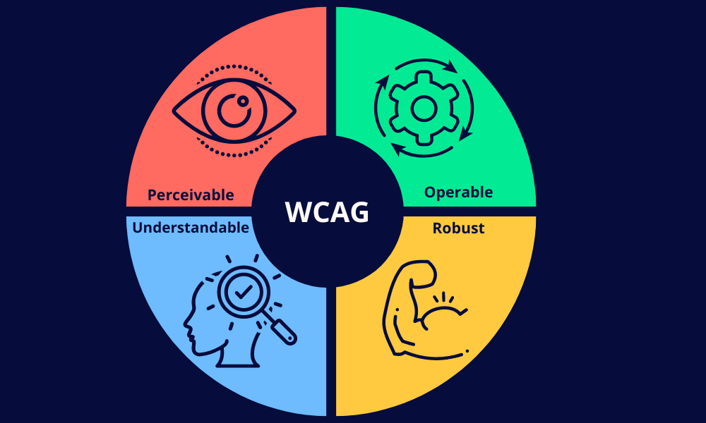
The Web Content Accessibility Guidelines (WCAG), developed by the World Wide Web Consortium (W3C), provide recommendations for making web content more accessible. These guidelines are organized around four principles: Perceivable, Operable, Understandable, and Robust (POUR). Each principle includes specific criteria that address various aspects of accessibility, such as providing text alternatives for non-text content and ensuring sufficient color contrast.
Digital Accessibility Laws
Various laws mandate digital accessibility to ensure inclusivity. In the U.S., the Americans with Disabilities Act (ADA) and Section 508 of the Rehabilitation Act require that digital content be accessible to people with disabilities. The European Accessibility Act (EAA) and the UK Equality Act 2010 are similar regulations that enforce accessibility standards in digital services within the EU and the UK, respectively.
By adhering to these guidelines and laws, developers can create inclusive digital experiences that benefit all users, regardless of their abilities.
Most Common Digital Accessibility Issues

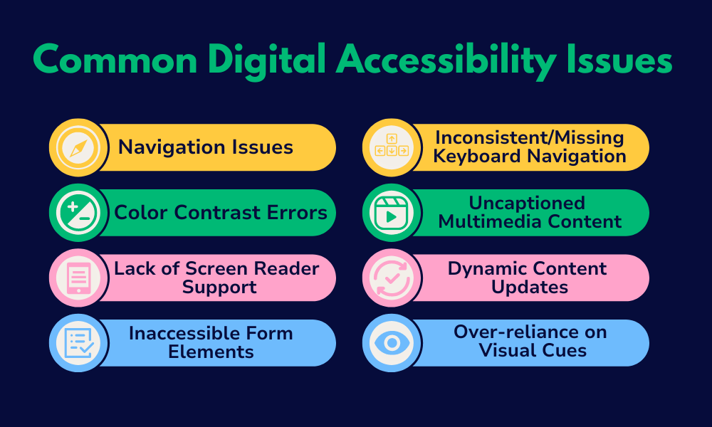
1. Navigation Issues
Poor navigation can hinder users with motor impairments or those relying on assistive technologies. Common issues include:
- Small touch targets
- Complicated navigation menus
- Absence of clear and consistent navigation paths
Solution:
- Ensure touch targets are at least 44×44 pixels (according to the WCAG).
- Use a simple, intuitive, consistent navigation structure and avoid deep, nested menus.
- Implement gestures cautiously, ensuring alternative navigation options, such as pointer gestures, are available.
2. Color Contrast Errors
Inadequate color contrast can make text and interface elements difficult to read for users with visual impairments, including those with color blindness. A study by WebAIM of the top 1 million home web pages shows that 81% of these home pages had low-contrast text.
Solution:
- For normal text, ensure a text contrast ratio of 4.5:1.
- For large text, ensure a text contrast ratio of 3:1.
- Ensure that non-text components (such as buttons or graphical objects) have a contrast ratio of 3:1.
- Check the contrast of your site or app’s color scheme using tools like
- WebAIM’s contrast checker (for websites)
- Color Contrast by UserLight (for iOS apps)
- Android Accessibility Scanner by Google (for Android apps)
3. Lack of Screen Reader Support
Many mobile apps do not provide adequate support for screen readers, making it difficult for visually impaired users to navigate and interact with the app.
Solution:
- Ensure that all interactive and visual elements are labeled correctly.
- Page navigation is clearly labeled with proper heading tags (‘<h1>’, ‘<h2>’) and ARIA landmarks (e.g., role=”navigation”).
- Use descriptive text for links.
- Verify that elements are keyboard accessible
- Use the
tabindexattribute to manage focus order effectively. - Test your website or app with popular screen readers like
4. Inaccessible Form Elements
Forms that are not accessible can prevent users from completing tasks. Common issues include unlabeled form fields, lack of error message descriptions, and poor focus management. A Fable study reports that 26% of surveyors reported missing error messages.
Solution:
- Provide clear and descriptive labels for all form elements.
- Use ARIA attributes to enhance form accessibility.
- Include notifications and error messages and ensure they’re descriptive.
5. Inconsistent or Missing Keyboard Navigation
Users who rely on keyboard navigation can find it challenging if the app does not support consistent and logical keyboard focus.
Solution:
- Implement keyboard navigation throughout your app.
- The tab order is logical and intuitive.
- Use the
tabindexattribute to manage focus order effectively. - Double-check that all interactive elements are reachable via keyboards, including the following:
- Forms
- Submission buttons
- Media players
- Navigation menus and submenus
- Sidebar content
- Embedded content
6. Uncaptioned Multimedia Content
Videos and audio content without captions or transcripts can exclude users who are deaf or hard of hearing.
Solution:
- Provide captions for all video content
- Include transcripts for audio content.
- Use automated tools to generate captions and then manually review them for accuracy.
- Ensure that multimedia content can be paused or stopped, and volume can be adjusted.
7. Dynamic Content Updates
If not handled correctly, users relying on assistive technologies can miss dynamic content updates (e.g., live chats and notifications). A Fable study reports that 30% of surveyors reported parts of a page or screen being blocked as a common accessibility issue. This can be caused by improper handling of dynamic content.
Solution:
- Use ARIA live regions to alert screen readers of dynamic content changes.
- Ensure important updates are conveyed through multiple sensory channels (e.g., visual and auditory).
8. Over-reliance on Visual Cues
Relying solely on visual cues (e.g., color changes, icons) to convey information can exclude users with visual impairments.
Solution:
- Use multiple cues to convey information. For example, combine color changes with text labels or patterns.
- Ensure that all critical information is accessible through text that screen readers can read.
Best Practices for Ensuring Digital Accessibility

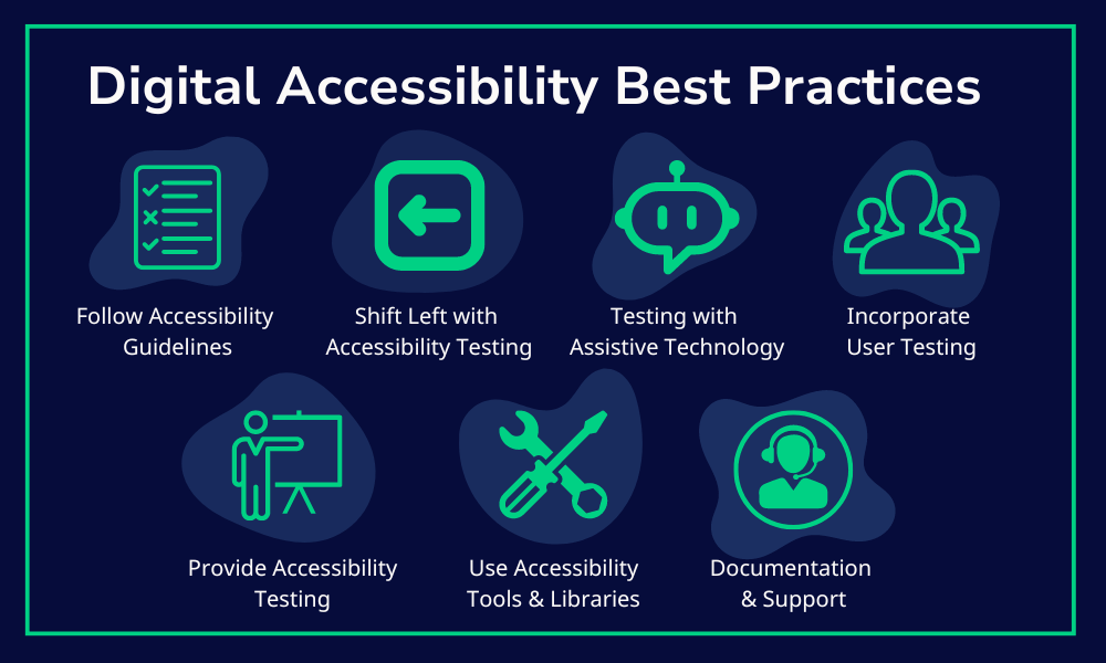
- Follow Accessibility Guidelines: Adhere to established guidelines like the WCAG and create an accessibility checklist to ensure full compliance with guidelines.
- Shift Left with Accessibility Testing: Shift left and integrate accessibility testing earlier in the design and development process to identify and address issues sooner.
- Testing with Assistive Technologies: Regularly test your app with assistive technologies like screen readers, magnifiers, and alternative input devices.
- Incorporate User Testing: Include users with disabilities in your testing process to gain valuable insights into real-world usage.
- Provide Accessibility Training: Ensure your development and QA teams are well-versed in accessibility principles and practices. Offer regular training sessions and update the team on the latest accessibility standards and tools.
- Utilize Accessibility Tools and Libraries: Leverage available tools and libraries to enhance accessibility. Tools like the Accessibility Scanner (Android) and VoiceOver (iOS) can help identify and fix accessibility issues.
- Documentation and Support: Provide clear documentation on your app’s accessibility features. Include a feedback mechanism for users to report accessibility issues.
Conclusion: Accessibility Issues with Comprehensive Solutions
Ensuring accessibility in mobile apps is not just a regulatory requirement but a moral imperative fostering inclusivity and equal access to digital content. By understanding common accessibility barriers and implementing the solutions outlined in this blog, you can create mobile apps that are usable by everyone, regardless of their abilities. Embrace accessibility as a core aspect of your development process and contribute to a more inclusive digital world.


