Visual validation testing has become an essential component of quality assurance in mobile and web development. As user expectations continue to rise, it’s crucial that mobile apps function correctly and look visually appealing across various devices and screen sizes.
Visual validation testing addresses this need by verifying the visual integrity of user interfaces and detecting anomalies that could detract from the user experience. This approach goes beyond traditional functional testing, providing a comprehensive solution to maintain the functionality and aesthetics of modern mobile apps.
What is Visual Testing?

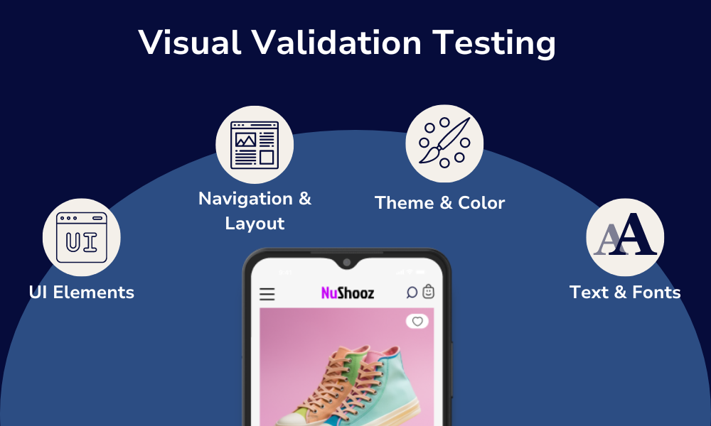
Visual testing validates an app’s visual output and compares it to the results expected by the design. In other words, visual testing catches the visual bugs in an app’s user interface (UI). This includes testing:
- UI Elements: Test UI components like text fields, buttons, icons, images, and other graphic elements to ensure they’re presented and positioned as intended.
- Navigation and Layout: Check that the app’s navigation and layout stay the same across different device screens, sizes, and resolutions.
- Theme and Color: Verify that the app’s color scheme and theme comply with your design guidelines.
- Text and Fonts: Identify that the correct fonts are used and that the content is readable across different screen sizes and resolutions.
Why is Visual Testing Important?
We’re all familiar with the phrase “Don’t judge a book by its cover,” and yet people do this all the time. Your mobile app is no different. On average, apps lose 77% of daily active users within the first 3 days of installation. In this modern age, maintaining user retention of your mobile app is akin to scoring a date on Tinder. If your app doesn’t fit a user’s expectations at first glance, the user will quickly swipe left and move on – potentially to one of your competitors.
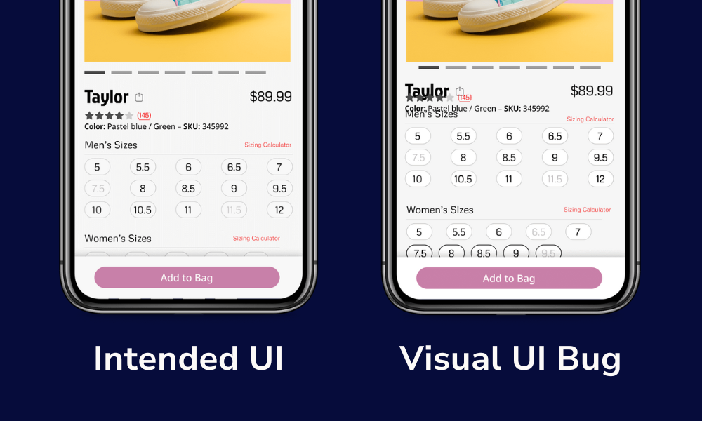
This is why visual testing is important. If you have visual bugs, like overlapping text or buttons that don’t appear where they should, they could be jarring enough to turn users away from using your app in the future.
Let’s look at this example of a product page in an eCommerce app. On a typical product page, you’d want to display details like the product name, color, size, etc. Intended UI in the image below). However, a visual bug like overlapping text and components (Visual UI Bug in the image below) can ruin this experience, potentially costing you a sale or even a recurring app user.

Catching these visual bugs before they’re released to production ensures your app meets design requirements and usability standards, cultivating a consistent user experience and increasing user retention.
Why Doesn’t Functional Testing Work for Catching Visual Bugs?
If you’re thinking, “Functional testing should be enough to catch any visual bugs,” then you might want to reconsider. While functional testing is essential, it falls short in catching visual bugs due to the following reasons:
- Focused on Functionality: Functional testing is primarily focused on verifying that an app’s features and functions work as intended. It doesn’t place much priority on an app’s UI or visual presentation.
- Limited Visual Context: Functional tests typically validate the underlying logic and data flow rather than the visual presentation of these elements.
- Dynamic Content and Layouts: Visual bugs often arise from dynamic content and responsive layouts, which are challenging to test with functional scripts. These bugs may only appear under specific conditions, such as different screen sizes, orientations, or device resolutions.
- Rendering Issues: Modern mobile apps often include complex UI elements like animations, transitions, and custom controls. Functional tests may not adequately cover these elements and miss visual glitches or misalignments.
- Subjective Nature of Visual Quality: Visual quality can be subjective, involving aspects like aesthetics, consistency, and usability, which are difficult to quantify in functional test scripts. Visual validation requires a human-like understanding of design principles, which functional tests lack.
- Lack of Visual Comparison: Unlike visual regression testing, functional testing frameworks usually don’t compare current UI screenshots to baseline images of your app to detect changes in appearance with app updates.
What is Manual Visual Testing?
Since automated functional testing tools are not suited for identifying visual bugs, the most common method for catching these bugs is through manual visual testing. Manual visual testing includes comparing a screenshot of your app’s UI with what’s visually presented on the app screen – kind of like playing a game of “Spot the Difference,” but there’s no cheat sheet with all the answers.
Manual visual testing can include inspecting and testing the following:
- UI Layout: Verify the app’s UI layout, including the alignment, positioning, and spacing of elements like buttons, text fields, images, icons, etc.
- Visual Elements: Check that elements like font style, sizes, and colors are consistent with design guidelines.
- Devices: Ensure the app displays correctly on different screen sizes and orientations. This includes testing the app on different devices to ensure a consistent user experience.
- Interactive Elements: Check the response of interactive elements like buttons, sliders, and dropdown menus.
- UI Updates: Compare the current UI with previous versions of the app to identify any unintended visual changes or regressions introduced by recent updates or code changes.
Challenges with Manual Visual Testing
Manual visual testing, while essential for ensuring high-quality user interfaces, presents several challenges:
- Time-Consuming: Manual visual testing requires significant time and effort, especially for large and complex applications. Each screen, layout, and interaction must be carefully inspected, which can be labor-intensive.
- Human Error: Testers can overlook visual defects, especially under time constraints. Subjectivity and inconsistencies in how testers evaluate visual elements can also lead to missed issues.
- Scalability Issues: As your app grows in complexity and the number of supported devices and platforms increases, manual visual testing becomes less scalable. Testing across multiple screen sizes, resolutions, and browsers can be overwhelming.
- Inconsistent Results: Different testers might interpret design guidelines and visual standards differently, leading to inconsistent test results. Subjectivity in visual assessment can result in varying levels of quality assurance.
- Lack of Coverage: It’s challenging to achieve comprehensive coverage through manual testing. Testers may prioritize critical paths and common use cases, potentially neglecting edge cases and less frequently used features.
- Difficulty Tracking Changes: It can be challenging to keep track of visual changes across multiple app versions. Without proper documentation and version control, it’s easy to miss regressions introduced by recent updates.
- CI/CD Restrictions: Integrating manual testing with continuous integration/continuous deployment (CI/CD) pipelines isn’t easy, limiting its effectiveness in modern development workflows that require continuous testing.
What is Automated Visual Testing?
Automated visual testing involves using software tools to automatically verify the visual appearance and behavior of a user interface (UI). This type of testing ensures that the UI elements are correctly displayed and function as intended across different devices, screen sizes, and environments.
It’s also important to note that many automated testing tools are also powered by artificial intelligence (AI), which can enhance visual testing. AI is revolutionizing the way we develop and test mobile apps, including how you can identify visual bugs during the testing process.
Here are some key processes of automated visual testing:
- Image Comparison: Automated visual testing tools capture screenshots of the UI and compare them against baseline images. Differences are highlighted to identify visual discrepancies.
- Pixel-by-Pixel Analysis: Automated testing tools perform a pixel-by-pixel comparison to detect even the smallest changes in the UI. This method ensures a high level of accuracy in identifying visual defects.
- Layout Verification: Automated tests check the layout of UI elements to ensure they are correctly aligned and positioned. This includes verifying margins, padding, and spacing.
- Cross-Device and Cross-Browser Testing: Automated testing tools often simulate the app’s appearance on various devices, screen sizes, and browsers to ensure consistency. This helps catch platform-specific visual issues.
- Dynamic Content Handling: Automated tests can handle dynamic content and responsive designs, ensuring that the UI adapts correctly to different contexts and interactions.
- Integration with CI/CD Pipelines: Automated visual testing tools can be integrated into CI/CD pipelines, providing continuous feedback on visual quality during development.
- Snapshot Testing: Tools can take snapshots of the UI at various stages of user interactions, allowing for a thorough examination of visual changes throughout the user journey.
Using Sofy for Visual Mobile App Testing

If you’re looking for the next revolutionary automated testing tool to perform top-notch visual testing, look no further than Sofy. Sofy, powered by OpenAI, is a scriptless automated testing platform that offers robust capabilities for visual testing. It ensures that your mobile app not only functions well but also looks exactly as intended across different devices and environments.
Here’s how:
Automated Visual Checks
Sofy’s automated tests can automatically capture screenshots of your app’s UI and compare them to baseline images. This process helps identify visual discrepancies such as misaligned elements, incorrect colors, and missing UI components.
Cross-Device and Cross-Browser Testing
With Sofy, you can run parallel automated tests on over 100+ Android and iOS devices, and across several different browsers. This ensures that your app’s UI is consistent, regardless of the platform, screen size, or resolution.
Regression Testing
You can integrate Sofy’s testing platform with your CI/CD pipeline to perform visual regression testing. This ensures that new code changes don’t introduce visual bugs or negatively impact the UI.
Visual Match
Sofy’s Visual Match feature is specifically designed to allow you to override and fine-tune your automated tests to ensure your test results accurately reflect any UI issues. With Visual Match, you won’t need to worry about flaky tests making you second-guess your visual testing.
Visual Validation: The Key to Superior User Experience
Incorporating visual validation testing into your development workflow is a strategic move that enhances both the functionality and user experience of your applications. By leveraging tools and techniques designed to automatically identify visual discrepancies, you can ensure that your UI remains consistent and appealing across all platforms and devices. This not only helps in delivering a polished product to your users but also streamlines the testing process, allowing your team to focus on delivering innovative features. As the importance of visual quality continues to grow, adopting visual validation testing will be key to maintaining a competitive edge and securing user satisfaction.
Interested in testing your app’s visuals with Sofy’s scriptless testing platform? Get a demo today!


