

When developing and testing an app on mobile devices, teams often focus heavily on the operating systems and the devices (like Apple or Android) they will be developing for. While these are certainly important aspects, it’s equally crucial to consider which mobile app form factors you want your project to support. Launching your solution on the wrong combination of app form factors could mean neglecting a significant segment of your target market. Conversely, spending resources to configure an app for a less popular form factor can cause budget overruns or project delays.
What Are Mobile App Form Factors?
A form factor refers to a computing device’s size, configuration, or physical arrangement. For mobile apps, form factors typically refer to the layout and screen size the application is designed to support.
For instance, the app form factor for a phablet will differ from that of a small smartphone with a screen size of 3.5 inches or less. A mobile app designed for a small phone will not perform as intended on a phablet or tablet.
However, this doesn’t mean you need to accommodate all app form factors in your project. When deciding which to support, consider usage trends among your target audience and general adoption trends.
For example, if most of your audience uses small and average-sized smartphones and phablets (more on that later), but only about 5% own a tablet, you might decide that supporting the tablet form factor isn’t a wise use of your resources.
Five Types of App Form Factors
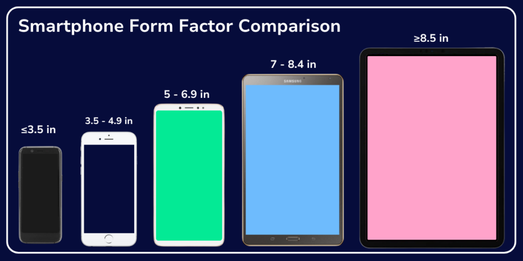
Generally, mobile app form factors can be grouped into five categories:
- Small Phones: Smartphones with screens 3.5 inches or smaller.
- Medium Phones: Standard smartphones like the iPhone and Samsung Galaxy, with screen sizes from 3.5 to 4.9 inches.
- Phablets: Larger smartphones that bridge the gap between medium-sized devices and small tablets, typically with screen sizes between 5 and 6.9 inches.
- Small Tablets: Tablets with screen sizes between 7 and 8.4 inches.
- Full-Size Tablets: Larger tablets like the iPad, with screens 8.5 inches or larger.
How App Form Factors Are Evolving
Mobile devices and app form factors are evolving due to device innovation and changes in consumer habits. Three types of devices currently have the most notable impact on mobile app testing:
Phablets
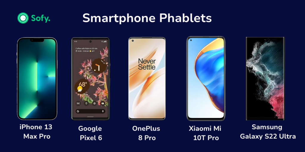
Initially viewed as an anomaly, phablets have become incredibly popular. Virtue Market Research reports that the phablet market was valued at USD 2.36 billion in 2023 and is projected to reach USD 6.7 billion by the end of 2030. Based on these current trends, it’s recommended that you address phablet form factors during DevOps processes.
Foldables
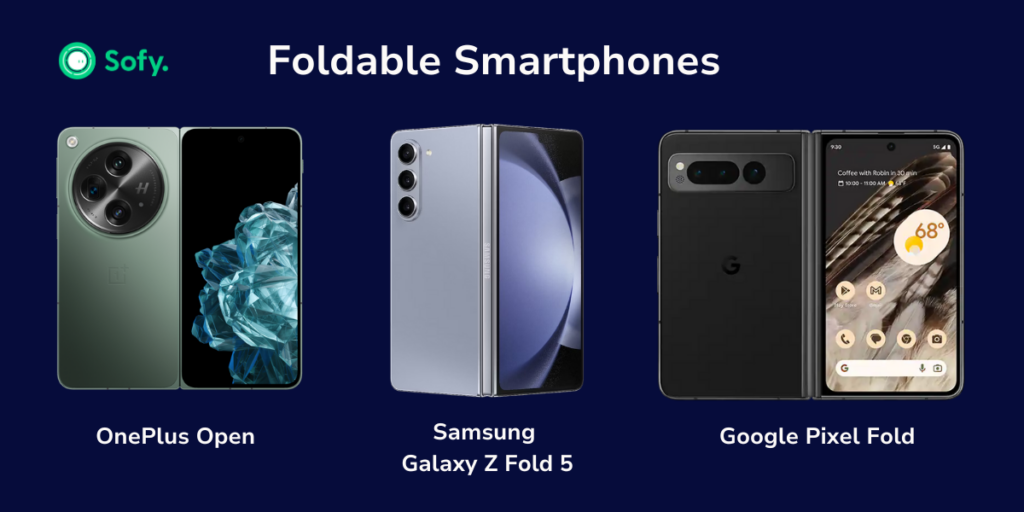
Foldable smartphones like the Samsung Galaxy Z Flip and the Google Pixel Fold are a growing trend in the smartphone marketplace. TrendForce reported that global shipments of foldable phones reached 15.9 million units in 2023, accounting for about 1.4% of the smartphone market. The total number of units shipped is expected to grow by 11% in 2024 (1.5% of the smartphone market).
While this percentage is small, incorporating foldable app form factors into your development workflow could give you a competitive edge if the foldable smartphone trend continues to grow.
Tablets
Tablets remain popular despite the availability of similar apps on smaller devices. Statista reports that around 128.5 million tablet units were shipped worldwide in 2023. In Q4 of 2023, around 55% of tablets worldwide ran on iPadOS. Adding tablet compatibility to your app can maximize adoption rates and tap into a healthy market of app users.
Why Test Various App Form Factors?
Real device testing involves running your application on different devices and OS versions to ensure it functions properly across a range of devices. This same principle supports the need for extensive mobile app form factor testing. An app that performs flawlessly on a standard smartphone might not function well on a phablet or tablet.
Supporting several mobile app form factors requires creating multiple configurations of your project. Even with the same framework, altering the display and layout can cause bugs or glitches. Form factor testing lets you detect and correct these issues before they impact the user experience.
Testing on Multiple Form Factors: Challenges and Solutions
Testing your mobile app on multiple different form factors isn’t easy, especially if you have a limited budget or resources. Let’s dive into some of these challenges, and how you can solve them:
Challenges
- Device Fragmentation: The diversity of screen sizes and resolutions can make it difficult to ensure a consistent user experience across all devices.
- Performance Issues: Different form factors can have varying hardware capabilities, affecting app performance.
- Usability Variations: User interactions may differ between a small phone and a tablet, requiring different UI/UX considerations.
- Time and Resource Intensive: Testing on multiple form factors can be time-consuming and require significant resources.
Solutions
- Automated Testing: Automated testing tools are used to streamline the testing process across multiple devices and form factors.
- Responsive Design: Implement responsive design principles to ensure the app adjusts to different screen sizes and orientations.
- Real Device Testing: Test on actual devices rather than relying solely on emulators or simulators to catch real-world usage issues.
- Prioritization: Focus on your target audience’s most popular form factors to optimize resource allocation.
Using Sofy’s Real-Device Cloud Farm
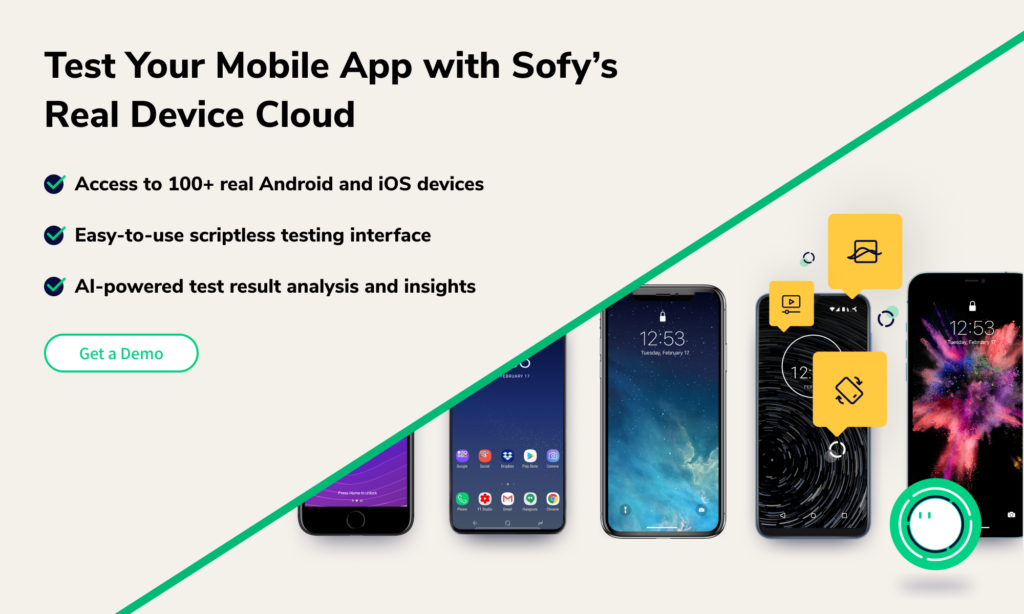
As we’ve discussed above, testing on multiple app form factors can be complex and time-consuming. Luckily, we have a solution: Sofy’s real-device cloud farm. Sofy offers a solution by providing access to a wide range of real devices from the cloud. Here’s how Sofy can help:
- Real-Time Testing on Real Devices: Access over 100 different Android and iOS devices, ensuring your app is tested on your users’ exact form factors.
- Automated Testing: Automate core testing processes to increase efficiency and thoroughness without manual intervention.
- Scalability: Scale your testing efforts to include multiple form factors without the need for a large in-house device lab.
- Continuous Integration: Integrate with your CI/CD pipelines to ensure continuous testing and validation of your app across different form factors.
Conclusion: Enhancing Mobile App Testing with Sofy
Testing your software across multiple app form factors is essential for maximizing reach and delivering a superior user experience. While this process can be daunting, tools like Sofy’s real-device cloud farm can streamline testing, allowing you to efficiently test and refine your app for various form factors. By leveraging automated testing and real-device access, Sofy helps ensure your app performs well across all targeted devices, setting you apart in a crowded marketplace.
To learn more about how Sofy can transform your mobile app testing, request a demo today and experience the benefits of automated, intelligent testing.